Color Theory for Mini Painters
Just enough color theory to make smart painting decisions
~4 min read
Warm, Cool, and Why It Matters
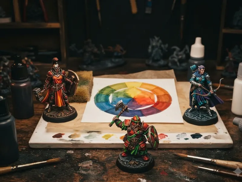
You don't need a fine arts degree to use color effectively on miniatures. Just a few simple concepts will make your models look dramatically better. The most useful thing to understand is the difference between warm and cool colors. Warm colors — reds, oranges, yellows — advance toward the viewer and feel energetic. Cool colors — blues, greens, purples — recede and feel calmer. Using warm colors on areas you want to draw attention to (like faces and weapons) and cool colors on receding areas (like cloaks and shadows) creates natural visual depth.
The second key concept is complementary colors — colors opposite each other on the color wheel. Red and green. Blue and orange. Yellow and purple. When placed next to each other, complementary colors create maximum contrast and make each other pop. A red cloak on a model with a green base will look more vibrant than a red cloak on a red base. You don't need to memorize the color wheel — just remember that opposites attract.
When shading, add a dark blue or dark brown to your base color instead of adding black. Pure black shadows look flat and lifeless. A dark blue shadow under red armor or a dark brown shadow under yellow cloth looks much more natural and rich.
- Warm colors (red, orange, yellow) draw the eye — use on focal points
- Cool colors (blue, green, purple) recede — use on supporting areas and shadows
- Complementary colors (opposites on the wheel) create the strongest contrast
- Shade with dark browns or dark blues, not pure black
- Highlight by adding an off-white or light yellow, not pure white (which looks chalky)
- Limit your palette to 3-5 main colors per model — too many colors look chaotic
Don't stress about getting colors "right." Miniature painting is more forgiving with color than you think. If a color combination looks good to you, it IS good. Trust your eye — it knows more than you think.
Sign in to track your progress